John ODonnell

A home page to expand on my data science projects. All source code can be found on my GitHub profile!
Please Contact for Resume.
Email: johnodonnell123@gmail.com
Phone: (936) 537 0533
View LinkedIn Profile
Exploratory Data Analysis for ~15,000 Oil & Gas Wells in the Williston Basin
Description: With Python, SQL and Plotly are used to generate high-level views on oil production from wells in the Williston Basin of North Dakota. The Jupyter Notebook can be found on my GitHub.The performance of these wells are governed by two primary sets of factors:
-
Geologic: Factors outside of our control but measurable. Parameters such as pressure, thickness, porosity/permeability, saturations (oil/gas/water), stress, natural fracturing, etc. The primary geologic drivers change for different parts of the basin and are very much a topic of interpretation. These variables are best viewed spatially on a map, not in tabular format.
-
Engineering: Factors under our control. These include depth and length of the well, where we place the well in the reservoir, how we stimulate the well (pumping fluid and proppant in to create fractures), and how closely we place multiple wells together (too close and they compete with one another, too far and we leave resource behind). These features are best viewed in tabular format.
- We don’t have any traditional geologic variables to work with here, nor do we have the information on how the wells were stimulated. We will have to be creative and work with what we have to generate features that approximate this missing data!
Data Context:
The data we are working with here was scraped from a webpage and stored in a SQLite3 database, which I cover in another project. For those unfamiliar with these oil and gas data types, I hope to provide some context. We will be working with 2 tables:
Header Table
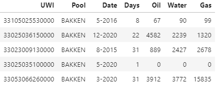
Contains general information about a well such as depth and location. It also contains the UWI (unique well identifier). There is a row for every well, leaving us with ~15,000 records.
Production Table (Time-Series)
Wells produce oil, water, and gas over time. This is our time-series data, which is why it is held in a separate table. Each of our ~15,000 wells have multiple records in this table, making is significantly larger at around 1.1 million rows. This table contains the UWI, the time stamp, the number of days that well actually flowed for that month, and the coinciding volumes for oil/water/gas.
What does the basin look like?
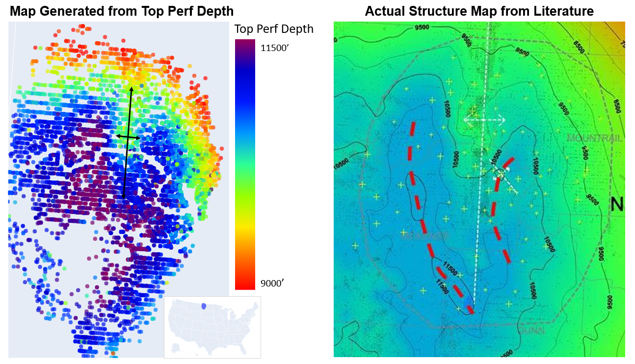
Here we have all 15,000 wells on a map, colored by the depth of the top perforation. The top perf on a well is typically within ~100’ of entering the formation, with this in mind we can use this perf depth as a proxy for formation depth. Looking at our map below it appears to be pretty accurate. The Williston basin has one structural feature that stands out from the others, the Nesson Anticline, which I have annotated here below!
What Operator has Produced the Most Oil to Date?
Using SQL to join and aggregate
%%sql

SELECT
  p.UWI, COUNT(DISTINCT p.UWI) AS 'Wells', SUM(p.Oil) AS 'Cumulative_Oil', h.Current_Operator
FROM prod_table p
JOIN header_table h
  ON p.UWI = h.UWI
GROUP BY Current_Operator
ORDER BY Cumulative_Oil desc
LIMIT 8

What Operator has Produced the Most Oil for their Well Count?
Displaying results with Plotly bar chart. Producing more oil with less wells likely translates into better project level economics (and better investments). This obviously has a temporal influence baked in, as some operators may simply have more wells that have been producing longer. It’s an interesting observation nonetheless.

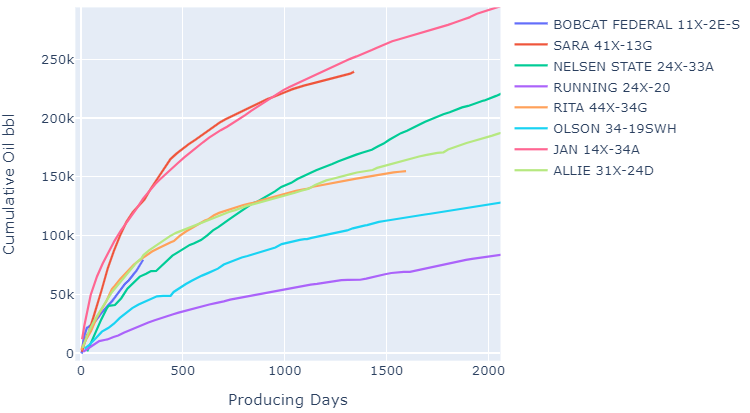
Cumulative Oil Production Plot
Here we choose 8 wells at random for a given operator and plot their oil production streams. This is a pre-defined plotting function I have created, which can be found in the notebook.
We start by defining our two DataFrames we want to use for input (which allows us to filter the data up front), then pass them as arguments to our function along with other options such as material and cumulative (boolean).
This function is capable of handling different streams (oil/water/gas), ratios (WOR/GOR), cumulative or monthly values, as well as cumulative AND monthly values. It can also group production by a given varaible and plot averages, as shown later in the project.
df9 = df_header[df_header['Current_Operator'].str.contains('XTO')].sample(8)
df_prod = df_production.copy()
# ---------------------------------------------------------
STREAM_PLOT(dataframe = df9,
            production_dataframe = df_prod,
            material = 'Oil',
            cumulative = 1,
            line_width = 2,
            width = 700, height = 500 )
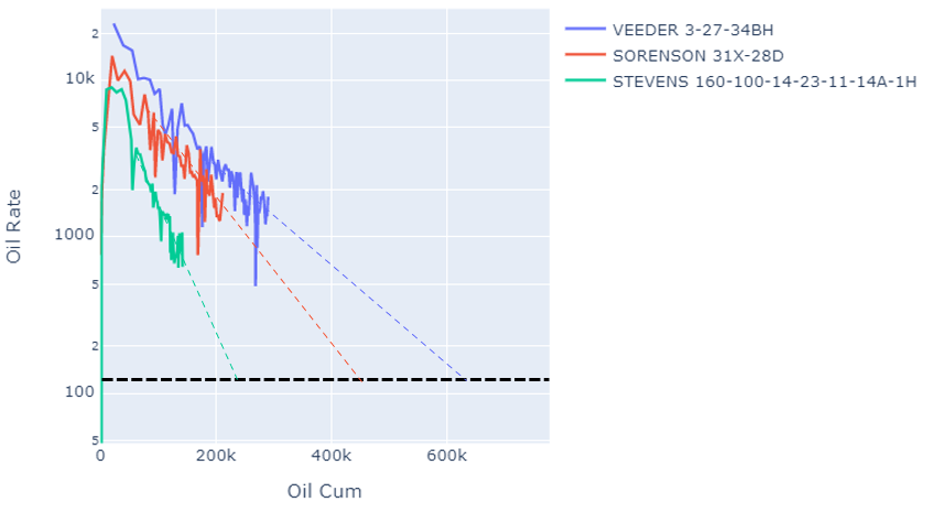
Oil Rate vs Cum Plot
This is a common display used for estimating the ultimate recovery for a well. One method is to extrapolate a straight line out from each trend to some operator specific economic abandonment rate. I chose an arbitrary value for this display, the intersection of the trend line with the black line represents our ultimate recovery.
df9 = df_header.sample(3)
df_prod = df_production.copy()
# ---------------------------------------------------------
STREAM_PLOT(dataframe = df9,
            production_dataframe = df_prod,
            material = 'Oil',
            rate_cum = 1,
            line_width = 2,
            width = 700, height = 500 )
Water / Oil Ratio Plot
Wells that produce less water are more favorable from an economic standpoint, as the water is costly to dispose of. Here we take a random sample of 1500 wells, bin them into groups defined by their vintage, then average their production streams every month (30.4 days) to create a new stream. As you can see, over time operators have been producing more and more water!
We also limit our production DataFrame to remove WOR’s that aren’t reasonable. This is a public data set and is full of noise!
df9 = df_header[df_header['Vintage_Year'] > 2008].sample(1500)
df_prod = df_production[df_production['WOR'].between(0,10)]
# ---------------------------------------------------------
STREAM_PLOT(dataframe = df9,
            production_dataframe = df_prod,
            material = 'WOR',
            cumulative = 0,
            variable = 'Vintage_Year',
            variable_dict = {'2008-2012':'grey','2012-2014':'gold','2014-2016':'orange',
                             '2016-2018':'red','2018-2020':'blue'},
            averages = 1,
            all_streams = 0,
            width = 800, height = 600 )

Oil Production Plot: Averaged by ~ Depth/Pressure
Here we are binning and averaging by the depth of the top perforation, which is a proxy for depth of the formation. The correlation between depth and pressure is pretty strong in this basin. Higher pressure normally leads to better wells, the relationship shows through clearly in the plot.
df9 = df_header.sample(5000)
df_prod = df_production.copy()
# ---------------------------------------------------------
STREAM_PLOT(dataframe = df9,
            production_dataframe = df_prod,
            material = 'Oil',
            cumulative = 1,
            variable = 'Top_Perf',
            variable_dict = {'0-9000':'grey','9000-1000':'gold','10000-11000':'orange',
                             '11000-12000':'red','12000-13000':'blue'},
            averages = 1,
            all_streams = 0,
            width = 800, height = 600 )

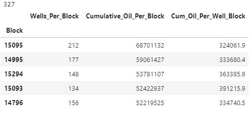
What Areas have Produced the Most Oil?
The basin is divided up into 6mi x 6mi squares called townships. This is a convinent way to represent the geologic impact of an area as the geology within a township is more/less the same, most consistently measurable variability exists at a larger scale than 6 miles. Let’s see what townships have produced the most oil.
query = %sql

SELECT
  p.UWI, h.Block, COUNT(DISTINCT p.UWI) AS 'Wells_Per_Block', SUM(p.Oil) AS 'Cumulative_Oil_Per_Block'
FROM prod_table_clean p
JOIN header_table_clean h
  USING(UWI)
GROUP BY Block
ORDER BY Cumulative_Oil_Per_Block desc

df_block = query.DataFrame()
df_block.drop(columns='UWI',inplace=True)
df_block.set_index('Block',inplace=True)
df_block['Cum_Oil_Per_Well_Block'] = df_block['Cumulative_Oil_Per_Block'] / df_block['Wells_Per_Block']

print(len(df_block))
df_block.head()
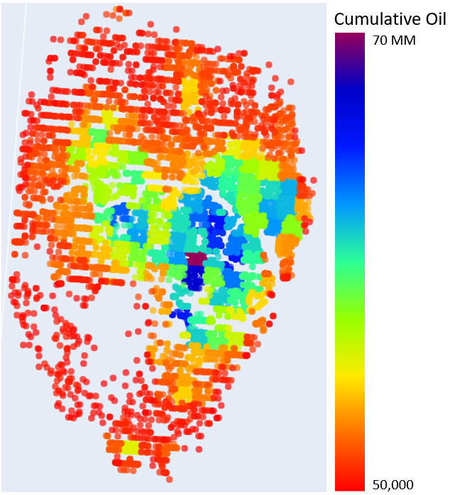
What Areas have Produced the Most Oil for their Well Count?
Let’s see what townships have produced the most oil for their well count. More oil with less wells (all well costs the same) translates into better project economics.
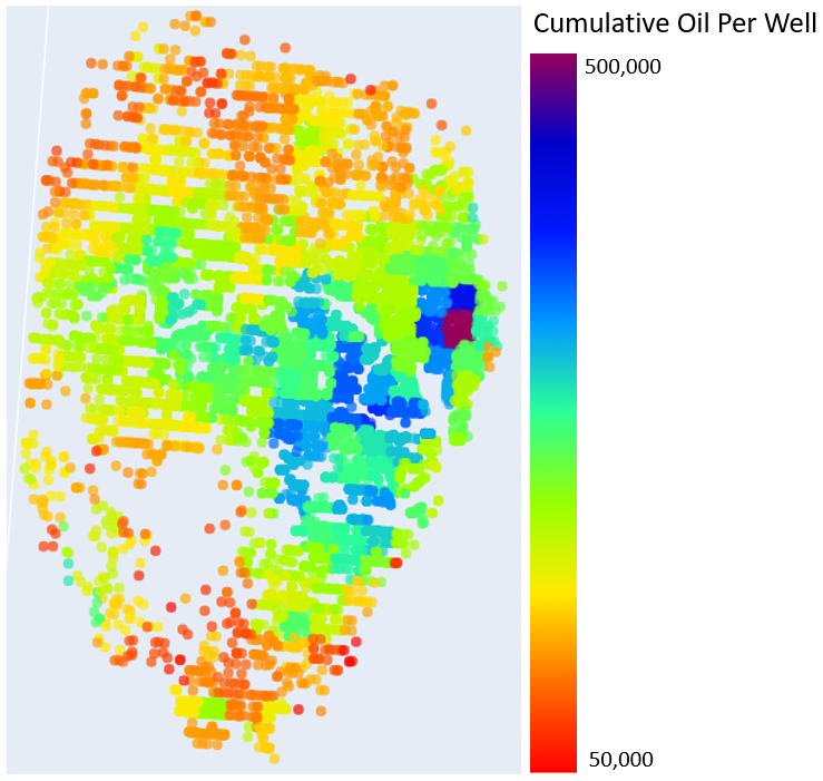
As you can see, this map looks notably different than the previous, showing that simply the number of wells in a township is in fact a primary driver. Would we want an investment in a township that has produced the most oil, or the township that produces the most oil per well drilled?
Wrap Up:
Here we have covered several tools that can be used for data analysis on oil and gas production data. This is just the tip of the iceberg when it comes to the analysis that can be completed on this dataset using these tools. There is a wealth of information publicly available for the Williston Basin that yields insight into performance (and ROI) drivers around the basin. Knowing how to manipulate, clean, analyze, and visualize it can be overwhelming with traditional methods. Hopefully, this short workflow demonstrates the value of these tools and knowing how to use them!